Consistency breaks most brand systems.
When building a visual identity, the goal is cohesion. The icon on the login screen needs to speak the same language as the hero illustration on the homepage. But most stock repositories function as chaotic aggregators. They throw together thousands of disparate styles from different contributors.
You might find a perfect “server error” illustration. But search for a “success state” image, and the results look like they belong to a completely different company.
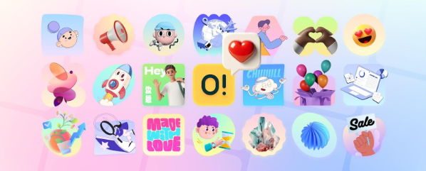
Ouch, the illustration library by Icons8, attempts to solve this fragmentation. It organizes its library not just by subject, but by strict artistic style. With over 101 options ranging from 3D renders to flat vector art, the platform positions itself as a middle ground between the chaos of general stock sites and the high cost of a custom agency.
For UI designers and marketers, the question is simple: Can a library like this actually replace the need for custom work in a scalable design system?
The Architecture of Style-Based Libraries
Categorization is the primary differentiator here. Instead of searching for keywords and filtering through a mixed bag of aesthetics, Ouch forces you to think in terms of “Styles.”
The library includes 44 distinct 3D styles and dozens of 2D vector categories. You aren’t just looking for “business”; you’re choosing between surrealism, sketchy looks, or simple line graphics.
This structure fixes the “Frankenstein” effect often seen in MVPs and startup marketing materials. When a visual identity feels cobbled together, trust erodes. By selecting a specific style-say, “Business 3D” or “Trendy”-a designer enters a closed ecosystem. Assets share line weights, color palettes, and perspective rules automatically.
Coverage matters too. The library contains over 28,000 business illustrations and 23,000 technology illustrations. Because Icons8’s internal teams and specific designers generate these, the assets extend to niche UX states. You won’t just find generic “shaking hands” imagery. You find specific assets for 404 pages, empty states, checkout flows, and add-to-cart actions within the same stylistic family.
Scenario 1: Constructing a SaaS UI from Scratch
Picture a UI designer tasked with reskinning a legacy B2B dashboard. The budget doesn’t allow for a dedicated illustrator, but the stakeholder demands a “modern, tech-forward” look.
The process begins by browsing the style catalog rather than searching for specific objects. The designer settles on a 3D style to add depth to the otherwise flat interface. Immediate requirement: a set of empty states. No messages, no data, and a disconnected server error.
Most stock workflows involve downloading raster images and hoping the resolution holds up. Here, the workflow leans on vector and 3D source files. The designer downloads the FBX files (for 3D) or SVGs (for 2D). Since the brand uses a specific shade of teal, they use the onboard recoloring tools before downloading. They don’t just tint the image; they map the brand’s hex codes to the illustration’s primary palette.
For the mobile view, the complex scene is too noisy.
The designer utilizes the “searchable objects” feature. Instead of using the full pre-made scene, they isolate specific layered vector graphics-grabbing just a floating cube or a character’s hand. This creates a simplified spot illustration that matches the desktop version without cluttering the mobile viewport. The result is a consistent visual thread across devices, achieved without drawing a single bezier curve.
Scenario 2: The Marketing Campaign Sprint
A marketing manager at a fintech startup needs to launch a newsletter and a supporting landing page for a new “Savings Jars” feature. The timeline is 48 hours.
They identify a flat, geometric style in Ouch that matches the existing app icons. Three distinct visuals are required: a hero image for the email, a banner for social media, and a spot illustration for the blog.
Searching the library, they find a “Finance” illustration that is 80% correct. The problem? It depicts a character holding a credit card, but the feature is about cash savings.
Integration with Mega Creator solves this. The manager opens the illustration in the editor directly from the browser. They delete the credit card element and swap it with a “piggy bank” object found in the same style library.
Next, the email footer needs a specific piece of clipart. They find a simple coin stack, recolor it to match the campaign’s green accent, and export it as a transparent PNG.
For social media posts, they opt for an animated Lottie file to increase engagement in the feed. They download the JSON file, hand it to the web developer, and the campaign launches. The assets look bespoke, despite being assembled from a library.
A Developer’s Workflow: Tuesday Morning
A frontend developer sits down to implement a “Success” modal for a payment gateway. No designer is assigned to this specific ticket.
- Selection: Open the Pichon desktop app (which mirrors the Ouch library). Filter is set to the “Color” style used elsewhere in the app.
- Format Choice: The payment confirmation needs to feel rewarding. Filter by “Animated.”
- Implementation: Find a checkmark animation. Instead of downloading a ZIP and unzipping it, drag the Lottie JSON file directly from the Pichon app into the VS Code project folder.
- Adjustment: The animation loops, but it should play once. Edit the properties in the code.
- Deployment: The asset is lightweight, vector-based, and scales perfectly on Retina screens.
Total time spent finding and implementing the graphic: 5 minutes.
Comparing the Ecosystems
Evaluating Ouch against the broader market clarifies the distinction between utility and volume.
Ouch vs. Freepik
Freepik is a massive aggregator. You will find millions of results, but they come from thousands of different contributors. Finding five images that look like they were drawn by the same person is a nightmare. Ouch has a smaller total volume but offers high consistency within its 101+ styles. If brand cohesion is the priority, Ouch reduces the hunt time.
Ouch vs. Undraw
Undraw is the open-source standard for startups. It’s free and reliable, but it suffers from ubiquity. Because everyone uses it, designs relying on it can look generic or “template-like.” Ouch offers more distinct, opinionated artistic styles (surrealism, bold colors) that help a brand stand out, though the best formats require a paid plan.
Ouch vs. Custom Illustration
Custom work is the gold standard for ownership. If your brand relies on a very specific metaphor (e.g., “a cybernetic octopus fighting a toaster”), stock libraries will fail you. But for standard business, tech, and educational metaphors, Ouch provides 90% of the quality at a fraction of the time and cost.
Limitations and When to Avoid
The library is extensive, but not infinite. Clear ceilings exist regarding what off-the-shelf assets can do.
- Specific Product Demos: You can’t use Ouch to demonstrate your specific UI or physical product. You still need screenshots or custom 3D renders for that.
- Exclusive Rights: These are non-exclusive assets. A competitor could theoretically use the exact same “Rocket Launch” illustration for their landing page. If IP ownership of brand assets is a legal requirement, commission custom work.
- Complex Narratives: Telling a sequential story (like a comic strip) involving the exact same character in 20 different poses is difficult. While some styles have extensive character poses, they aren’t rigged character models that can be posed infinitely.
Practical Tips for Implementation
Follow these practices to get the most out of the library without exposing the “stock” nature of the assets:
- Always Recolor: Never use the default colors. Even a slight shift to match your brand’s primary and secondary colors makes the asset look native to your platform.
- Leverage Lottie: Static SVGs are great, but the library offers Rive and Lottie JSON formats. Replacing a static PNG with a lightweight vector animation significantly elevates the perceived quality of an app.
- Mix and Match Objects: Don’t just download a full scene and paste it. Use Mega Creator or a vector editor to remove background elements or combine objects. This reduces the chance of someone recognizing the image from another site.
- Check the Format: For developers, grabbing the code-ready versions (SVG/JSON) is usually better than raster formats (PNG). It allows for CSS manipulation and ensures crispness on all displays.
Ouch effectively answers the central question of brand consistency by shifting the focus from “image search” to “style adoption.” It lets teams rent a visual identity that feels bespoke, provided they stick to the architectural rules of the chosen style.


