Great user experiences don’t happen by accident—they are crafted through intentional, research-backed decisions. UX design, short for User Experience Design, is the process of enhancing user satisfaction by improving the usability, accessibility, and emotional impact of a digital product. Whether you’re working on an app, website, or SaaS dashboard, following the foundational principles of good UX ensures your product is functional, intuitive, and emotionally satisfying.
If you’re building designs that prioritize user experience, tools like Figma Resources can speed up your workflow. This platform offers free templates, UI kits, and design assets specifically tailored for designers focused on user-first solutions.
Let’s explore the 10 essential principles of good UX design and how applying them can elevate your product’s overall performance.
1. User-Centered Design
Design with Real People in Mind
User-centered design begins with understanding your audience. Instead of making assumptions, UX designers rely on qualitative and quantitative user research to define user personas, journeys, and goals.
Effective design aligns with the context of real-life users—what they need, how they behave, and what challenges they face. Interviews, usability testing, heatmaps, and analytics all contribute to refining the experience around user behavior.
Incorporating feedback loops throughout the design process ensures that products remain aligned with actual user needs. This principle reminds us that design is not about what we like—it’s about what works best for the people using the product.
2. Clarity and Simplicity
Keep Interfaces Clean and Intuitive
One of the most powerful design choices is simplicity. Clear, uncluttered interfaces help users navigate with ease and perform tasks without friction. Simplicity doesn’t mean stripping away functionality—it means minimizing distractions and prioritizing important content.
Every visual element—buttons, icons, fonts, and text—should serve a purpose. When users land on a page, they should immediately understand what action to take. This clarity increases task completion rates, decreases bounce, and improves retention.
Simplicity also extends to language. Microcopy should be short, jargon-free, and user-friendly. If users have to pause to understand what something means, you’ve lost a moment of engagement.
3. Consistency
Create Predictable Patterns Across the Experience
Consistency in design builds familiarity, confidence, and ease of use. When users can anticipate what will happen next, they feel more in control. This predictability is what helps reduce the cognitive load.
Visual consistency involves maintaining a cohesive style across colors, typefaces, iconography, and layout. Functional consistency ensures similar interactions behave the same way—like buttons, menus, or dropdowns.
Using a unified design system helps you maintain this principle efficiently. And when using platforms like Figma, consistent UI kits from sources like Figma Resources can drastically speed up implementation.
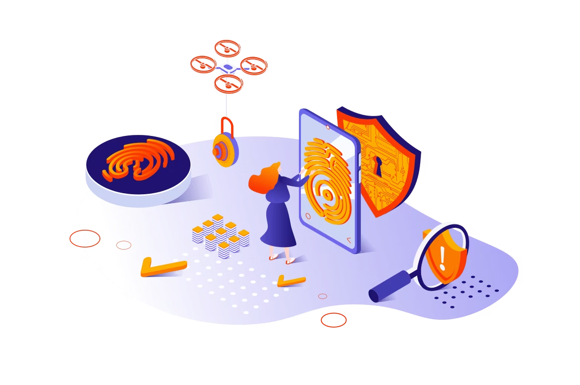
4. Accessibility
Design for All Abilities
Design is inclusive when it can be used by as many people as possible—regardless of physical or cognitive ability. Accessibility ensures that no user is excluded from using your product, which is both a moral and business imperative.
Color contrast, screen reader compatibility, keyboard navigation, and alternative text for images are just a few areas to address. Following accessibility standards like WCAG 2.1 helps maintain legal compliance and user satisfaction.
Moreover, designing with accessibility in mind improves usability for all users, including those on mobile devices, in poor lighting conditions, or using slower networks.
5. Feedback and Response
Keep Users Informed Through Clear Signals
Feedback is the bridge between user action and system response. Whether a form is submitted, a button is clicked, or a file is uploaded, users need confirmation that their action was received and processed.
Immediate feedback builds trust. Microinteractions, loading indicators, success messages, and error alerts all provide essential context. Even subtle animations can enhance the perception of responsiveness and give users confidence.
Failing to provide feedback makes your interface feel unresponsive and ambiguous, leading to frustration or abandonment.
6. Flexibility and Efficiency of Use
Adapt to Both New and Power Users
Good UX design supports multiple usage patterns. Beginners may need step-by-step instructions, while power users appreciate shortcuts and advanced features.
Designing for flexibility means offering multiple ways to complete a task, accommodating different devices, and supporting a range of user preferences. Customization, saved settings, and quick-access menus are ways to enhance efficiency.
In business software and enterprise platforms, this principle becomes especially critical—where expert users want fast workflows without sacrificing clarity for occasional users.
7. Visual Hierarchy
Guide Attention and Organize Content Effectively
Users scan rather than read. A strong visual hierarchy helps direct attention by emphasizing important elements through size, color, placement, and spacing.
Headers should stand out. Primary actions should be easily visible. Supporting information should be de-emphasized without being invisible.
Designers use grids, white space, and contrast to create a logical flow. The goal is to make sure users can find what they’re looking for within seconds, without hunting through cluttered interfaces.
Visual hierarchy also ties into accessibility, as clear organization supports assistive technology and makes interfaces easier to navigate for everyone.
8. Error Prevention and Recovery
Help Users Avoid and Correct Mistakes Easily
A well-designed interface prevents users from making errors in the first place. This includes smart defaults, real-time validation, and informative guidance.
But when errors happen, users need constructive help. Error messages should be polite, specific, and offer solutions. Phrases like “Invalid input” are too vague—try “Your password must include a number and a symbol.”
Offering undo options, soft warnings before irreversible actions, and autosave features are examples of building forgiveness into your interface.
Preventing frustration improves user satisfaction and can significantly reduce support requests.
9. Performance and Speed
Ensure Your Interface is Fast and Responsive
Speed is a key component of UX. No matter how beautiful your interface is, if it’s slow, users won’t stick around. Performance affects not just user satisfaction but also SEO and conversion rates.
Optimize images, minimize code, and reduce unnecessary animations to ensure fast load times. Responsive interfaces that react quickly to input give users a sense of control and fluidity.
Designers should collaborate with developers early in the process to anticipate performance pitfalls and address them proactively.
10. Emotional Design
Create Delight and Memorable Moments
Beyond usability, emotional design taps into the human side of interaction. Delightful microinteractions, playful animations, and moments of surprise can elevate the user experience from functional to meaningful.
Consider how your product makes users feel. Does it inspire confidence? Calm? Excitement? The emotional layer of design helps build a brand connection and long-term loyalty.
Even small details—like a well-written confirmation message or a witty empty state—can make a big difference in how your product is perceived.
The 10 principles of UX design—user-centered design, clarity, consistency, accessibility, feedback, flexibility, visual hierarchy, error handling, performance, and emotional engagement—are not just best practices; they are foundational to creating digital products that people love to use.
These principles work together to create intuitive, efficient, and emotionally resonant experiences. As technology continues to evolve, users’ expectations rise with it. Investing in UX is no longer optional—it’s essential for business success.
For designers looking to build experiences with these principles in mind, resources like Figma Resources offer high-quality, free assets that can accelerate your workflow and keep your design system consistent.